
Visualizing Stock Data With Candlestick Charts in Python
First we need a couple of libraries that we need to to import.
We’re going to need mlp-finance as well because this is the library that allow us to plot the candlestick chart. Because map table itself dose not have a function that offers plotting account stick chart.
import datetime as dt
import pandas_datareader as web
import matplotlib.pyplot as plt
import matplotlib.dates as mdates
from mpl_finance import candlestick_ohlc
ohlc means opened high-low close. The difference in order is just the order of the values. It will be important because we’re going to restructure the data frame later on and we need to put our data in this specific order to it.
Define Time Frame
The start time is free to define but you got an error message if the time is too early when the enterprise do not exist.
start = dt.datetime (2023,3,1)
end = dt.datetime.now()
Load Data
This function need four parameters. The first parameter is the ticker symbol of the stock we’re interested in, we can search it in the net if we don’t know the actual ticker symbol. The second parameter is the Finance API we’re going to use. And the last two parameters are actually quite simple, it’s just the start date and the end date.
Yahoo change its API, we need to change the data resource.
data = web.DataReader('AAPL', 'stooq', start, end)
print(data.columns)
Restructure Data
We will get an array or a list of the columns. And we only need four of those values: high/open/low/close. And to that, we restructure our data in a specific way.
data = data[['Open', 'High', 'Low', 'Close']]It is crucial to keep the order here, we need it to be in the function.
The data columns need to be in a specific format, the data columns we got earlier on is in the date format but for the function we need it to be in the number format or in a numerical format. To do that we need to convert it. Since the data column is now the index column(行索引列表), we can’t manipulate it. So we need to reset the index.
data.reset_index(inplace=True)Just means that we replace the actual or the current data frame by the now one which has now reset the index, because otherwise we need to write data = data.reset_index(), which don’t resend index. But instead of doing that we just pass this parameter or set this parameter to true.
So we now we can do is manipulate the data column*(列索引列表)*.
The next step is to map a certain function onto our data values. This convert the data from date format into the numerical format.
data['Date'] = data['Date'].map(mdates.date2num)Visualization
To plot data, first we need to define axis here and named it “ax”, which is just the subplot. It’s just a convention. Why we done this, because the candlestick function takes is the first parameters a subplot.
ax.xaxis_date() :By using this function,we just define that matplotlib visualizes the data width, or labels the data with the actual data format
Finally we can candlestick_ohlc to plot our data.
ax= plt.subplot()
ax.xaxis_date()
candlestick_ohlc(ax, data.values)
plt.show()
But now you’ll notice that it looks quite ugly at least how I think it’s.
The next step is to take a little bit care of the design and style of our plot. We need to have a grid, have a dark background and we can choose the colors for upward and down movements and this is we do right now.
First of all, let’s activate a grid here. Then put the grid below the candlesticks.
ax.grid(True)
ax.set_axisbelow(True)
If you like light color you don’t need to do this below.
ax.set_facecolor('black')
ax.figure.set_facecolor('#121212')
Then we’re going to set our tickers or the tick parameters to a white color.
    ax.tick_params(axis='x', colors='white')
    ax.tick_params(axis='y', colors='white')
The last thing is to set the width of the candlesticks and also the colors for the upward movement. It is better to use a hex code here for green, which will be a bit lighter.
candlestick_ohlc(ax, data.values, width=0.5, colorup='#00FF00')And the title.
ax.set_title('AAPL Share Price', color = 'white')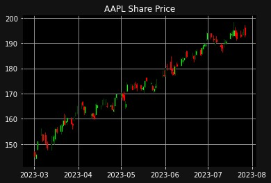
The final complete code is as follows:
import datetime as dt
import pandas_datareader as web
import matplotlib.pyplot as plt
import matplotlib.dates as mdates
from mpl_finance import candlestick_ohlc

start = dt.datetime (2023,3,1)
end = dt.datetime.now()

ticker = "AAPL"
data = web.DataReader(ticker, 'stooq', start, end)
print(data.columns)

data = data[['Open', 'High', 'Low', 'Close']]
data.reset_index(inplace=True)
data['Date'] = data['Date'].map(mdates.date2num)

ax= plt.subplot()
ax.xaxis_date()
ax.grid(True)
ax.set_axisbelow(True)
ax.set_facecolor('black')
ax.figure.set_facecolor('#121212')
ax.tick_params(axis='x', colors='white')
ax.tick_params(axis='y', colors='white')
candlestick_ohlc(ax, data.values, width=0.5, colorup='#00FF00')
ax.set_title('{} Share Price'.format(ticker), color = 'white')
candlestick_ohlc(ax, data.values)
plt.show()